learning a brand by making it
the situation
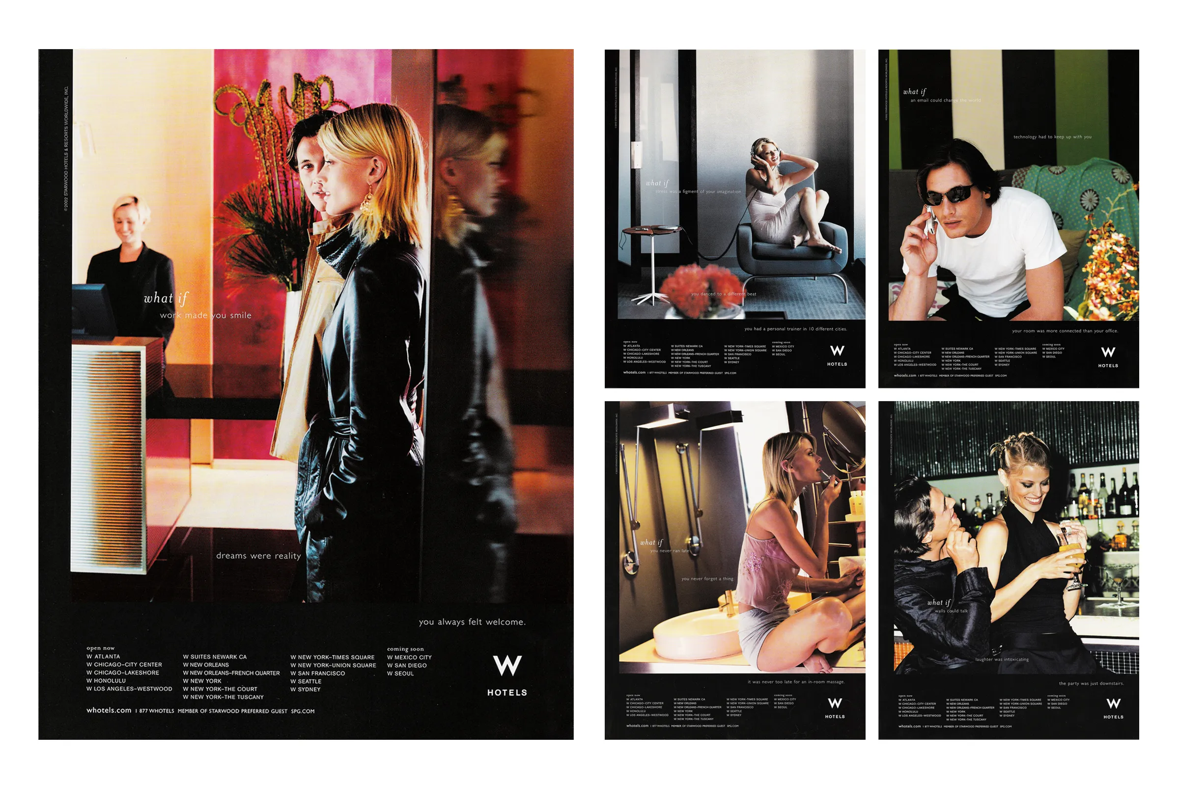
W Hotels was a boutique hotel chain, and the account sat with G Whiz!, a subsidiary of Grey Advertising. The look and feel of the brand was still being worked out, so building awareness and deciding what W actually looked like happened at the same time.
what i made
Designed advertising and marketing collateral to build brand awareness for the chain.
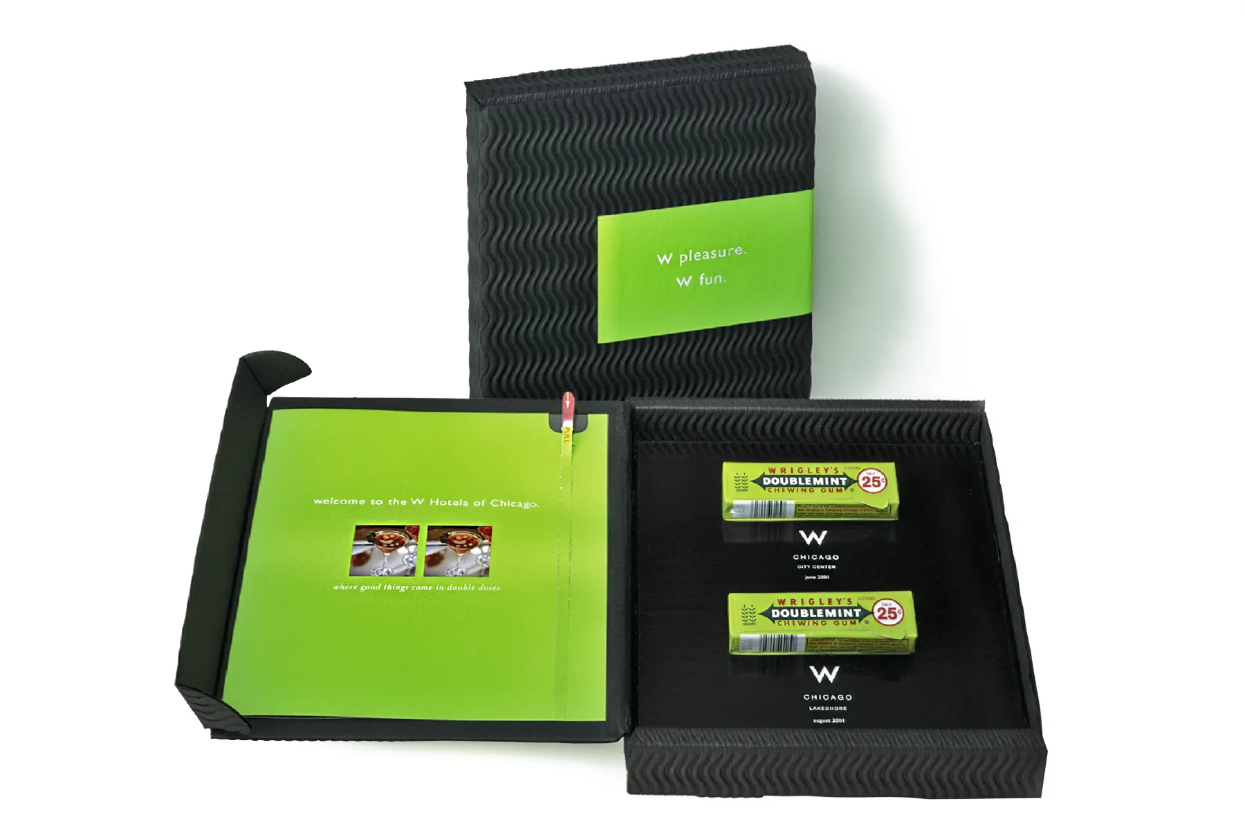
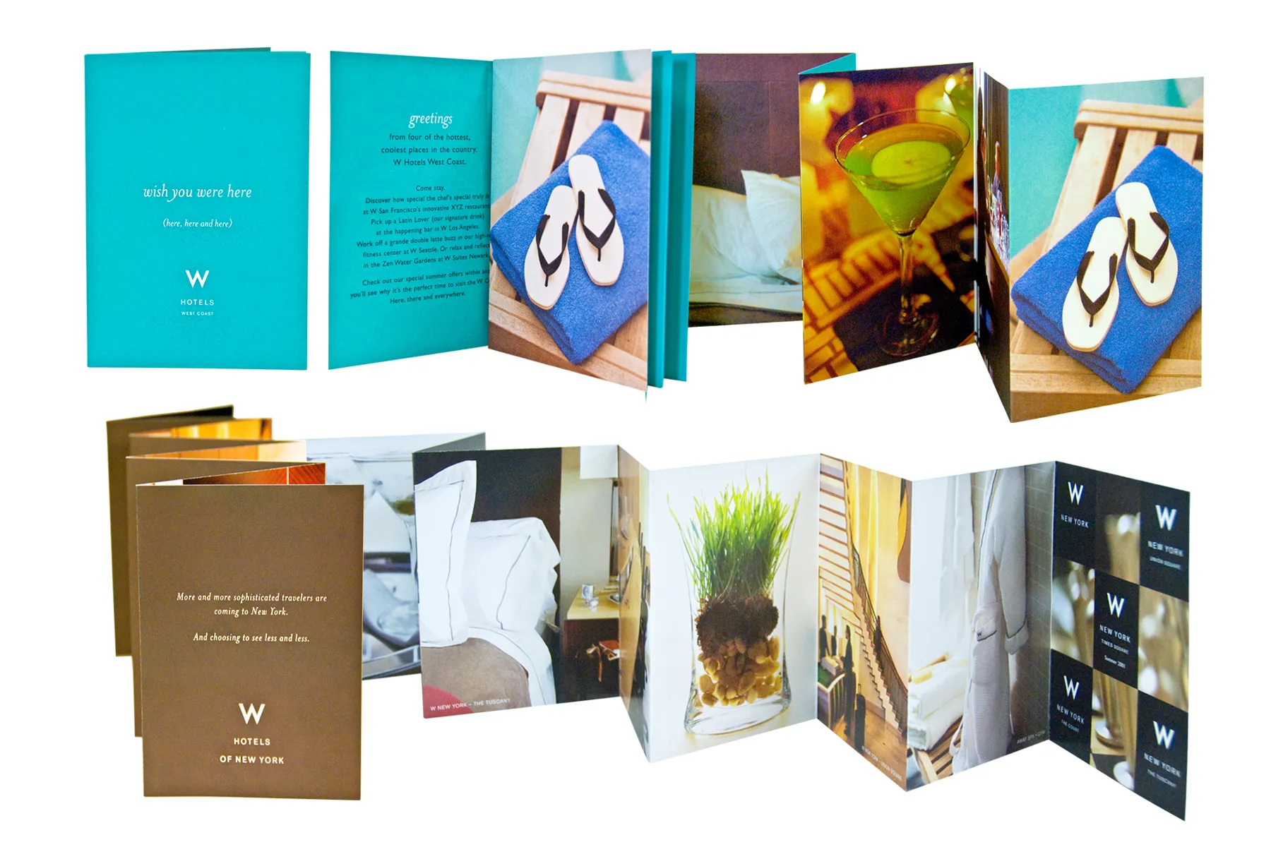
Produced high-end direct mail. The format where stock, finish, and how a piece opens carry as much of the brand as the layout does. An education in the physical properties of design that has been useful ever since.
Worked on the brand standards and guidelines. Rules for the logo, the photography, and the typefaces, developed with copywriters, account managers, and the client.
Managed the brand photography library. A growing archive of W imagery, and the first one I was responsible for. I have been building and running them ever since.

what i'd tell you about it
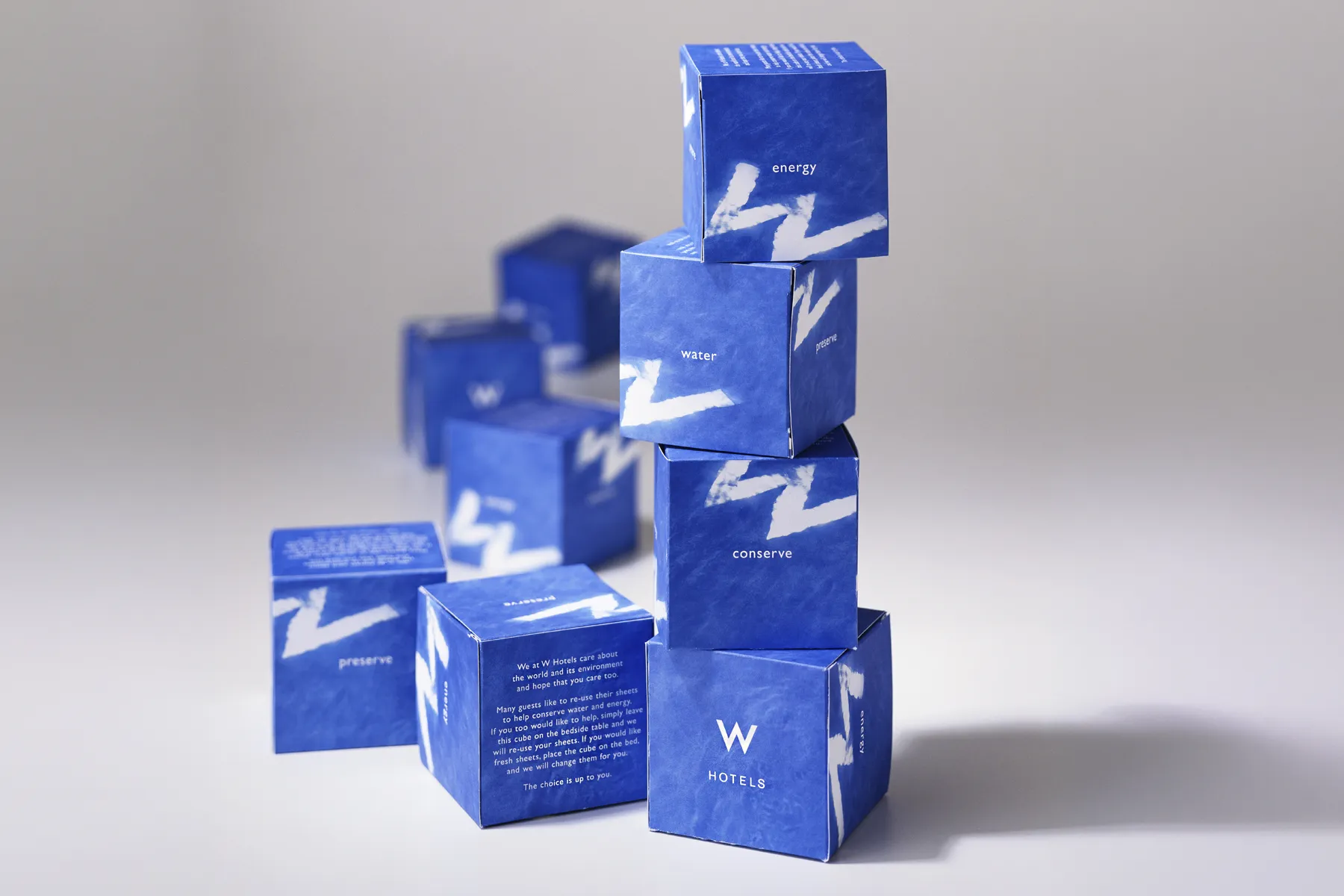
This is the oldest work on the site, and it's here because it explains the rest. Nobody called it a design system then. We made the ads, the mailers and the in-room pieces, and the rules for the logo, the photography and the type came out of that work rather than ahead of it. The rules outliving the campaign is more or less what I've been doing since, whether the deliverable was a packaging system or a shared class system in Webflow. I was lucky enough to learn from inspiring art directors, writers, stylists and photographers while working on this account, and I've tried to carry that class and style through the rest of my career.